What does the iPhone logo mean? Why is there a bitten apple on the Apple logo? Jobs' idol is coolly shown in the movie "The Imitation Game"
Everyone knows the Apple logo in the form of an apple. The choice of an apple is obvious - "Apple" in translation from English means exactly "apple". But few people know why this apple is bitten. Who bit him? For what purpose? Does it make any sense?
First of all, let's figure out why the name of the company, and accordingly for the logo, is used "Apple". As writes, this was beaten in the very first Apple logo, which was created in 1976. Then one of the co-founders of the company - his name was Ronald Wayne made a drawing, which became the first logo.
First Apple logo
The logo created by Wayne has nothing to do with the current one. It was a miniature depicting Isaac Newton, an English scientist, on whose head an apple fell when he settled down to rest in the garden, after which an insight came to him. This idea was the basis for choosing the name and logo of the company.
The logo, although educational, had little in common with the requirements that are usually placed on logos. It was unrecognizable, poorly suited for printing work, for applying to the company's products. Therefore, the Wayne logo lasted about a year, after which Steve Jobs turned to graphic designer Rob Janov with a request to create a modern, recognizable logo.
Second Apple logo
As Yanov later said, the idea for the logo appeared unexpectedly. Rob bought some apples, put them in a bowl and began to draw, discarding unnecessary details. The result was an apple that looked like a tomato or a cherry. It remained to make one more stroke so that the apple was unambiguously recognized as an apple.
So there was a "bite". The idea came after a play on words byte / bite (byte / bite off): on the one hand, a technology company that works with information (bytes), on the other, an apple that can be bitten, while a tomato can only be cut.
However, the second logo was different from the current one: it was made multi-colored. This has given rise to many versions, the most common of which is that Apple supports sexual minorities.
But it is not so. Apple does support the LGBT community, but the color logo was created a year before the rainbow was introduced as a gay symbol. At the time of the birth of the logo for Apple, this sign was not recognizable, so it has nothing to do with LGBT people.
Then why was the apple multi-colored?
The idea was very simple. At that time, color monitors had just entered the market, and the color Apple logo was intended to reflect the fact that the company produces computers with color monitors. The display of a Mac computer at that time could display six different colors, which were indicated on the logo. All the primary colors were placed randomly, but the green on top was Jobs' wish that the apple could be topped with a leaf, which is always green. In this form, the logo lasted 22 years.
Third Apple logo
The third logo is devoid of color. And to do so came up with designer Jonathan Ive.
It happened in 1998. At the time, Apple was in huge financial trouble. But Steve Jobs figured out how to save the day. He relied on elegance and simplicity. Such was the order for the new logo: to make elegance and simplicity recognizable.
- And why are your apples all bitten?- So it's American, the Apple variety!
Everyone knows that the Apple logo has been a bitten apple for a long time, but few people understand why such an emblem was chosen. Let's try to make a short digression into the history of the company's logo.
The image of the first Apple logo was Isaac Newton, who was sitting under a tree. However, the emblem also depicted an apple hanging on a tree, in a halo. Not surprisingly, the company's employees almost immediately decided to change the Apple logo. The representatives of the company decided to contact advertising agency Regis McKenna, who was famous at the time. The new Apple symbol began to be developed by well-known designer Rob Yanov, who was able to take his own work with all seriousness.
Active cooperation between Rob Yanov, who was already 57 years old, and young Jobs began immediately after their meeting. The designer was surprised when a young man walked in with a homemade box. But at the same moment, he realized that the company's logo needs to be radically redesigned in order to win people's attention and improve the image of the enterprise. Of course, the work was difficult, because many were ready for the bankruptcy of Apple Computers, because a negative image of the company had already been formed, paying attention to the unsuccessful logo. In addition, further entry into the market was impossible under the current situation. After a long conversation with the designer, it was decided that the logo must have an apple, but it was not clear from what angle the fruit should be presented. But, as you know, the simplest solution can be the best. As a result, the designer and Jobs realized that the ideal logo is a monochrome apple that will be bitten off on the right side. Jobs really liked the image of a bitten apple, but he decided that the logo must be in color. Boss advertising company he put a lot of effort into convincing Jobs, because if he chose a color image, he would have to allocate a significant amount of money to the printing house.

However, the founder Apple was sure that he was right, because he believed that only a color logo could ennoble the company and help form a good image, despite a bad start. As a result, the emblem became colored, and in this version it lasted until 1988. After that, the image of the apple still began to be performed in white and black.
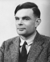
Now we propose to find out why the apple nevertheless became bitten. Many people believe that Steve Jobs chose this trademark because he associated the apple with the fruit of the tree of knowledge or with the apple that fell on the head of Isaac Newton. In addition, it is considered that founder of Apple could decide to beat a couple of consonant words, namely: bite (bite), as well as byte (byte). One version of why such a logo was designed says that the designer cut out a small piece, since the first sketches looked like a tomato. However, the most common version in the scientific community says that the Apple trademark is a bitten Turing apple. As you know, the work of Alan Turing on the creation of the first computers, as well as the development of programming methods were very important, because they became the basis for numerous studies in the field artificial intelligence. During World War II, Alan worked at Bletchley Park, which was a large and well-known cryptographic center. At that time, he was the head of one of the five groups that were responsible for deciphering the various messages that were encoded by the Enigma apparatus. In 1947, Turing managed to create a computer that became one of the very first and best. It would seem that the career started very well, and Alan will do well, but suddenly there was a loud scandal. Turing's apartment was stolen in 1952. During the investigation, the police were able to find out that the apartment was robbed by a friend of Alan's lover.

It is important to note that Turing never tried to hide the fact that he had a non-traditional sexual orientation, but at the same time he did not advertise it, because the British treated such deviations very badly.
On March 31, 1953, a trial was held during which Turing was asked to either accept a 2-year prison sentence or suppress his own libido with special estrogen injections. That is, agree to chemical castration. The scientist realized that it was necessary to choose the second. However, on June 8, 1954, Alan Matheson Turing committed suicide by biting into an apple that contained potassium cyanide. At the moment when Alan was found dead, a bitten apple lay next to him.
So it was or otherwise, with the death of Jobs, there were no witnesses left. But the bitten apple has firmly established itself as the logo of one of the most famous computer (and not only) manufacturing companies. The logo has been played up more than once in films, fotozhabs, jokes .. but it fulfilled the main function - it was firmly remembered. And, sometimes biting an apple, we automatically notice - "Oh, Apple!"
Everyone knows the Apple logo in the form of an apple. The choice of an apple is obvious - "Apple" in translation from English means exactly "apple". But few people know why this apple is bitten. Who bit him? For what purpose? Does it make any sense?
First of all, let's figure out why the name of the company, and accordingly for the logo, is used "Apple". As writes, this was beaten in the very first Apple logo, which was created in 1976. Then one of the co-founders of the company - his name was Ronald Wayne made a drawing, which became the first logo.
First Apple logo
The logo created by Wayne has nothing to do with the current one. It was a miniature depicting Isaac Newton, an English scientist, on whose head an apple fell when he settled down to rest in the garden, after which an insight came to him. This idea was the basis for choosing the name and logo of the company.
The logo, although educational, had little in common with the requirements that are usually placed on logos. It was unrecognizable, poorly suited for printing work, for applying to the company's products. Therefore, the Wayne logo lasted about a year, after which Steve Jobs turned to graphic designer Rob Yanov for help with a request to create a modern, recognizable logo.
Second Apple logo
As Yanov later said, the idea for the logo appeared unexpectedly. Rob bought some apples, put them in a bowl and began to draw, discarding unnecessary details. The result was an apple that looked like a tomato or a cherry. It remained to make one more stroke so that the apple was unambiguously recognized as an apple.
So there was a "bite". The idea came after a play on words byte / bite (byte / bite off): on the one hand, a technology company that works with information (bytes), on the other, an apple that can be bitten, while a tomato can only be cut.
However, the second logo was different from the current one: it was made multi-colored. This has given rise to many versions, the most common of which is that Apple supports sexual minorities.
But it is not so. Apple does support the LGBT community, but the color logo was created a year before the rainbow was introduced as a gay symbol. At the time of the birth of the logo for Apple, this sign was not recognizable, so it has nothing to do with LGBT people.
Then why was the apple multi-colored?
The idea was very simple. At that time, color monitors had just entered the market, and the color Apple logo was intended to reflect the fact that the company produces computers with color monitors. The display of a Mac computer at that time could display six different colors, which were indicated on the logo. All the primary colors were placed randomly, but the green on top was Jobs' wish that the apple could be topped with a leaf, which is always green. In this form, the logo lasted 22 years.
Third Apple logo
The third logo is devoid of color. And to do so came up with designer Jonathan Ive.
It happened in 1998. At the time, Apple was in huge financial trouble. But Steve Jobs figured out how to save the day. He relied on elegance and simplicity. Such was the order for the new logo: to make elegance and simplicity recognizable.
The Apple logo, in the form of the well-known bitten apple, has a rather fascinating history. But even some three decades ago, no one knew about him. Now let's talk about this story.
In 1976, two young Teskey guys decided to register their company under the name "Apple Computers". And the names of these young people were Steve Wozniak and Steve Jobs, then the guys themselves could not even imagine that after going through all the trials, they would be able to become the owners of the most popular company on the planet. In those distant times, they just sat in their garage and did what they loved. Their first brainchild was a computer based on the Mos Technology 6502 processor. It was then that the first rudiments of the logo appeared.

True, at that time, the logo was an unattractive drawing of the physicist and mathematician Newton, who sits under a tree and an apple dangles above him. Steve Jobs almost immediately realized that “you can’t cook porridge” with such a logo, and ordered its design from Regis McKenna. One of the studio's designers, Rob Yanov, responded to Jobs' request and created the famous apple. 
Although they say that because of the closed source code for Mac OS and iOS there are no viruses, viruses still make their way to Apple laptops. And if suddenly you need to remove the banner from the desktop, we recommend that you turn to professionals, and not engage in amateur activities. 
The idea of the designer was not to simply depict an apple, but to give the logo deep meaning. But no matter how hard he tried, he couldn’t succeed, and then, already completely desperate, the designer sat in an armchair and bit off an apple. And then he came up with the idea of creating a logo in the form of a bitten apple in black and white. But Steve Jobs insisted on a color image. As a result, Apple has become a company with an ingenious logo. The apple remained colored until 1988, after which it became black and white.
The first Apple logo was designed by Ron Wayne. This name says little, not only to the townsfolk, but even to geeks. Meanwhile, Ronald is the third co-founder of Apple, and also the biggest loser of the 20th century. He sold his 10 percent stake in the company for $800 just 11 days after registration. If not for this rash step, Ronald would now be one of the wealthiest people in the world with a fortune of $ 30 billion. Analysts say that the value of Apple will triple in three years, which means that Wayne may have lost about 100 billion simply by not believing in Apple.
The logo created by Ronald Wayne has nothing to do with the current one. It was a miniature work of art. In the center was the outstanding English scientist Isaac Newton, on whom an apple is about to fall (an insight!). In the future, the "Newton theme" will continue when Apple releases its PDA.
If you enlarge the logo, you will notice that along the border is the text: Newton… A Mind Forever Voyaging Through Strange Seas of Thought… Alone This is a line from William Wordsworth's autobiographical poem, The Prelude, which goes like this in its entirety:
And from my pillow, looking ahead by light
Of moon or favoring stars, I could behold
The antechapel where the statue stood
Of Newton with his prism and silent face,
The marble index of a mind for ever
Voyaging through strange seas of Thought, alone.
It looks like this in translation:
From my pillow, lit by the light
Moon and good stars, I could see
On the pedestal is a statue of Newton.
He is holding a prism. Quiet face
Like a mind dial that's alone
Floats through Thoughts strange seas.
 The logo turned out to be interesting (all these references to Newton, who really was alone, a touch of mystery, etc.), but not very suitable for reality modern business. Therefore, Wayne's work was used for about a year. Steve Jobs then turned to graphic designer Rob Janoff for help. It was required to create a simple, modern looking, well recognizable logo.
Rob completed this task in about a week. In an interview with the Revert to Saved blog, Yanov talked about how the logo was created. Rob bought some apples, put them in a bowl and began to draw, gradually removing unnecessary details. The famous “bite” was made on purpose: it was necessary to draw the logo so that it was strongly associated with apples, and not other fruits / vegetables / berries. The similarity of pronunciation byte / bite (byte / bite off) also played into the hands.
![]()
Rob Yanov made the logo in color, which gave good ground for speculation and myths. The most common, actively supported by Win-users and Linux users, is that the Apple symbol reflects the support of sexual minorities. This is not entirely true. Apple really supports the LGBT community, as evidenced by recent video, however, the color logo was created a year before gays began to use the rainbow as a symbol.
 The second myth is even more interesting. They say that an apple painted in the colors of the rainbow is a kind of sign of respect for Alan Turing. Turing is an outstanding English mathematician and cryptographer who made a feasible contribution to the fight against fascism. During World War II, he cracked the Kriegsmarine and Enigma ciphers, and after that he had a huge impact on computer science (Turing test, works on the theory of artificial intelligence). Turing's merit did not save him from criminal prosecution for homosexuality. Alan faced two years in prison if he did not agree to hormone therapy (which, among other things, led to breast growth and chemical castration). In addition, the most valuable thing was taken away from Turing: the opportunity to do what he loves - cryptography. As a result, Alan became a recluse, and then completely committed suicide. Moreover, the form of suicide was very unusual: Turing bit off an apple, which he had previously pumped with cyanide.
Rob Yanov debunks both myths. According to him, you should not look for a secret meaning. The color Apple logo was meant to reflect the fact that the company makes computers with color monitors. The poppy display at that time could display six colors. These colors were just indicated on the logo. There are also no regularities in the arrangement of flowers. Janov placed the colors in random order, with only green being placed first on purpose.
In this form, the logo lasted 22 years. In 1998, Steve Jobs, who had previously been expelled from Apple, returned to the company. Apple was experiencing huge financial difficulties. Competitors sarcastically advised to close the shop and distribute money to shareholders. We needed drastic measures. And do you know what pulled Apple out of the crisis? Industrial designer Jonathan Ive has come up with a new case for the iMac G3.

![]() Computers that look like lollipops literally saved Apple. Moreover, they have become iconic - their images flashed in films, TV shows, glossy magazines. It is clear that a motley logo on a colored poppy would look silly. Apple has moved away from using a color logo. So since 1998 we have seen a laconic monochrome logo. The company has matured. And we are with her.
Computers that look like lollipops literally saved Apple. Moreover, they have become iconic - their images flashed in films, TV shows, glossy magazines. It is clear that a motley logo on a colored poppy would look silly. Apple has moved away from using a color logo. So since 1998 we have seen a laconic monochrome logo. The company has matured. And we are with her.
Rob Yanov created an outstanding logo. This is not a banal insignia, but a real Symbol. But Yanov's merits were not somehow particularly noted by Apple. At the beginning of the post, I mentioned the Nike logo. It was created by Carolyn Davidson, a student and freelancer from Oregon. Nike, at the time a young company, paid $35 for the work. But ten years later, the founder of the company, Phillip Knight, gave her an expensive ring with a diamond "stroke" - corporate identity, as well as an envelope with company shares. Knight appreciated the designer's work, making her co-owner of Nike (albeit with a small package).
It might be useful to read:
- The term for the purchase in the schedule What does the letter e mean in the schedule;
- The most comprehensive review and test of the SJCAM SJ4000 WiFi action camera;
- How is the consideration of the first parts of applications for participation in the electronic public procurement auction?;
- What criteria does a customer choose a supplier for?;
- Xiaomi surveillance cameras: an overview of the range of devices Firmware Xiaomi Yi Ants;
- A public offer is a targeted invitation to a deal!;
- Warranty;
- IP Camera Xiaomi Yi Smart CCTV with IR Light Connection xiaomi yi ip camera;