Printed design. Polygraphic design. Technical requirements for printing design
REFINING THE FINISHED LAYOUT:
Printing design, revision of vector graphics:
- adding offsets or indents to the layout in curves 300 rubles.
- change of color model (CMYK or RGB) 300 rub.
- conversion to curves 300 rubles.
- resizing 300 rub.
Refinement of raster graphics:
- image resizing 300 rub.
- adding departures to the layout, by scaling 400 rubles.
- adding departures to the layout, painting a simple color 400 rubles.
- adding flights to the layout, the cloning tool 1100 rubles.
Translation in PDF:
- from Word'a 300 rubles.
- from PowerPoint (with subsequent scaling up to A4) 600 rubles.
- ready-made layout from graphic programs with refinement for offset 400 rubles.
Assembling multiple files into one PDF:
- without modification, from ready-made PDFs 300 rubles.
Change the size of PDF 200 rubles.
PERSONALIZATION:
- file creation, automatic personalization RUB 1100
- manual revision (if necessary) 1000 - 3000 rubles. (1100 rub / hour)
OTHER POLYGRAPHY DESIGN OPERATIONS:
Drawing to curves:
- just 800 rubles.
- average RUB 1,700
- difficult 3300 rubles
- the complexity of the coat of arms - negotiable
Typing:
- A4, 12 pt 1700 rub. (minimum 50 rubles)
- info for a business card (name, position, address, phone) 150 rubles.
Retouching, color correction:
- change of tone, etc. in the photo 1000 rubles.
- cleaning a raster file with the "cloning" tool 1200 rub.
- image clipping 1500 rub.
Selection of photos:
(3-5 photos are provided on each topic) 500 rubles.
Scanning:
- up to A4 (inclusive) RUB 300
- \u003e A4 (with subsequent gluing) RUB 800 - RUB 1200
Selection of the font 500 rubles.
Surcharge for urgency (in the presence of the client) - 100%.
We all read text from left to right. Therefore, with a cursory glance at the layout, first of all, a person begins to get acquainted with it. from the upper left corner (that's why they often put a logo there) gradually going down to the lower right (often there are addresses and contacts). Taking into account this peculiarity of perception in the design of printing, the logical chain is built in exactly this sequence.
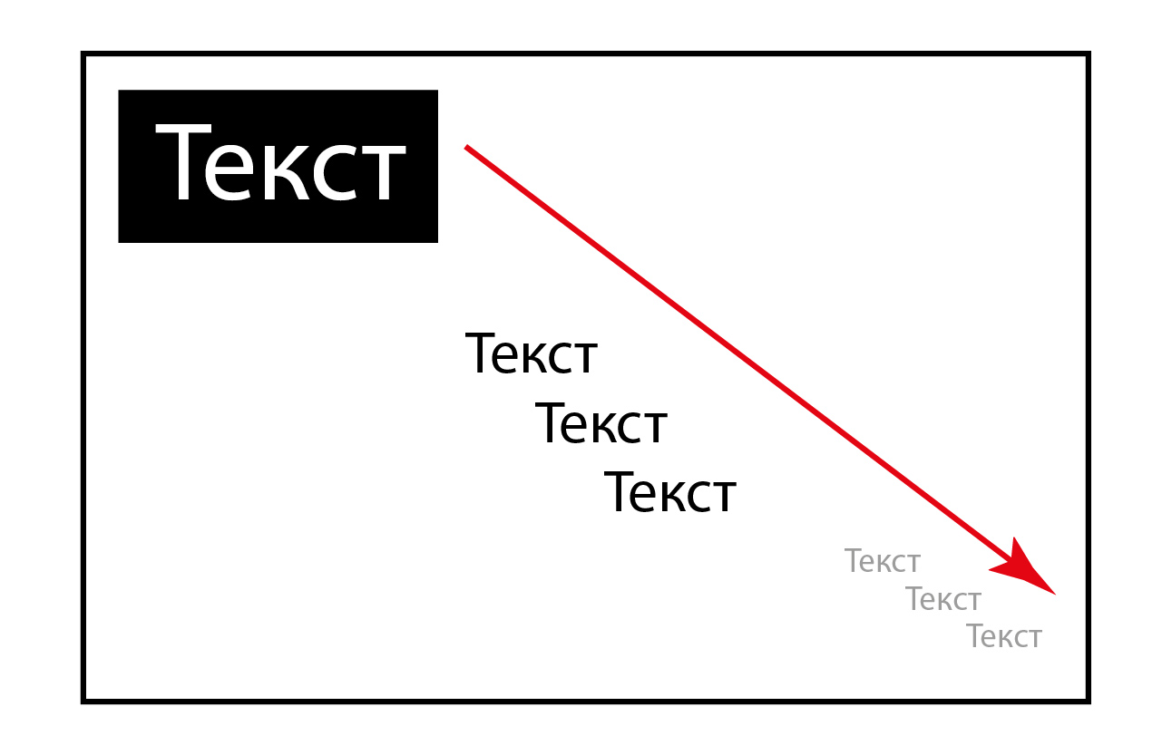
In addition, in the first place, attention is drawn to large and dark spots and gradually the gaze moves to the study of lighter and smaller design elements.
If we consider the layout from the point of view of the text component, then there is the main and secondary text. It is worth distinguishing between them by font size and color tone. Often, an advertiser thinks that every word is important in his layout, therefore he places a lot of text of the same size, such a layout of the printing, which is covered with holes, is difficult to read, and although there is all the information about the company and the biography of all employees ... the essence is lost, such a leaflet or no one will read the booklet.
So, the text should, if possible, be separated by empty margins and diluted with photographs for a more comfortable perception. It should be borne in mind what will primarily attract large text on a dark or bright block. Agree, one sentence written in medium print on an A4 sheet of paper is much easier to read than an entire page covered in small print.
So, everything is good in moderation. It is important to catch the middle ground so as not to overload the printing layout with a lot of information and at the same time use empty space. The main thing to understand when creating a layout is what information is main and what is secondary, what to pay attention to first of all.
Selection of colors
Color plays a lot important role in creating a layout. The perception of information on the layout depends on the choice of colors. It's nice to look at the layout with well-chosen colors, and the color itself without words can say about the scope of the advertised enterprise.
All colors can be divided into cool, warm and neutral shades. Cool colors are blue, green, cyan, etc. Warm - red, yellow, brown, etc. Neutrals include lilac and shades of gray (black to white).

Each individual color evokes certain associations in a person, and the combination of several colors can carry certain information.
For example. Restaurant advertising fast food is most often performed in yellow-red-brown colors, such colors can be associated with food of the corresponding color - hot baked goods, hamburgers, cakes, etc.
Color and tone contrast
Each color also has its own tone, in other words, saturation. Therefore, you need to compose colors so that light tones lie on dark ones and vice versa. If, for example, red text is placed on a purple background, then it will be very difficult to read, because these two colors have the same saturation.

There is a special scale to help you choose the right color.

The main goal of printing design

A common mistake of novice designers is that they forget about the main goal of poly graphic design... Carried away by various design tricks and inducing beauty, they lose sight of the fact that the main goal of design is advertise a product or service. Various special effects and design ideas can be so distracting that behind them the main purpose of the layout is lost - to convey to consumers information about the product or services.
Of course, for a more pleasant perception, they are needed, but various design bells and whistles should help, not distract from the main point.
About text and pictures
 It is often said that "it is better to see once than hear a hundred times." There is some truth in this proverb because a person thinks in images (pictures), and not in words and sentences. When a person reads a text, images associated with words are drawn in his head (none of us have a running line in front of our eyes, like a terminator)). Therefore, the text itself is quite difficult to perceive, and even now no one will waste time reading a huge piece of text, no matter how good it is. The picture is perceived instantly, and can tell better about the product than a large block of text.
Now, in almost all layouts, except for text, pictures are used. For a more interesting design, photographs are placed partially or closed in curly blocks. It is important that, despite the interesting design, the essence of the photo is easily perceived and important elements carrying the semantic load are not cut off.
So, text without pictures is bad, and pictures without text have no meaning. Only a competent combination of them guarantees the success of your masterpiece.
Of course, it is impossible to reduce the entire design to any rules. Design is an art, there are no rules here, just tips to help you avoid common mistakes. Try, experiment, do not be afraid to make a mistake and then every time your design will come out better and better.
Share your rules and tips in the comments to the article.
In contact with
Classmates
From this article you will learn
- What is print design
- What are the basics of print design
- What are the forms of print design
- What are the stages of the development of design of printed products
Print design is a vast area of \u200b\u200bknowledge about the techniques and principles of illustrating printed products. Of course, its importance is undeniable. Technologies, techniques and rules created during the existence of the printing industry make it possible to present products in a good light, accurately influencing the emotions of the consumer. While print design has many positive aspects, it has one serious disadvantage: the field of knowledge is so broad that it is not entirely clear where to start in order to create some kind of idea about it. This article aims to break this barrier and introduce the reader to the basic principles and rules of print design.
What print design looks like
Design of advertising and printing products - a subspecies of graphic design, whose main task is considered to be the creation of materials for the future product. In most cases ready product presented at hard copy... In addition to advertising purposes, print design is widely used in print media, therefore, there are four areas of its use:
- mass advertising;
- advertising printed products;
- multipage products;
- periodicals.
Print design as a company style with a winning design
New companies and production facilities appear every year, which increases the competition in the field of sales. Any company dreams of standing out from the crowd, getting a big name, popularity among customers, and introducing them to its proposals. For this reason, the importance of promotion, especially of printed materials, in this area has grown so much recently. Print media has become almost the most widely used advertising method, as it has a low cost and proven effectiveness. All this makes it possible to quickly transfer the necessary information to a large number of potential consumers.
To attract the attention of a potential client, various options for print advertising are used: booklets, leaflets, brochures, catalogs, calendars, etc. Each person has a huge number of print design products, and they all assure that their offer is better and of higher quality ... How not to get confused in this amount of information?
Obviously, a person who comes to an exhibition or presentation will notice, first of all, the catalog that looks attractive from the outside. And only after that, he may have a desire to study in more detail what is contained inside. As the example shows, two equivalent characteristics play a key role in the creation of a printed product: an unusual design that can capture a person's attention, and printing of an appropriate level.
Bright design and layout in combination with high quality printing, it is generally recognized as the main method of attracting the eyes of visitors towards objects of advertising printing. They borrow key positions in the production of business cards, leaflets, booklets, catalogs, brochures, as well as in the creation of emblems and other details corporate culture... A well-chosen design will be the key to a successful marketing campaign.
The functioning of any company cannot be imagined without a printed handout material... Leaflets and other variants of it, speaking about your activity, occupy key positions in the formation of the company's image, development, stability of the entire business, and its popularity among other companies. Therefore, during the development of a project of advertising products, one cannot do without printing designers. Believe me, competent design can be incredible. An experienced, extraordinary thinking specialist will make a simple booklet to such an extent workable, colorful and attractive that the hand will not rise to send it to the trash can.
For printing design, the following main tasks are envisaged: creating the appearance of an advertising printing product, forming a corporate style of the company.
Professional design takes an incredibly important place in the creation of the company's corporate style. Think for yourself: a letter that came in an envelope with brand name organizations, first examine, and only then open. The look itself creates such an important first impression of the entire company. The design of the image component requires the same serious approach as the creation of advertising printing. In some cases, it is he who affects the growth of popularity.
Printing design includes the development of a company logo or the entire style of the company, creative printing design with a professional selection of fonts, tones, composition, arrangement of blocks in the future product, a harmonious combination of the latter. It necessarily provides for additional operations: photography, scanning, layout, collages, color correction, retouching, etc.
Only when using a well-thought-out design will your printed matter look in such a way that every potential consumer will be pleased to hold it in his hands, to find out what is inside. The likelihood of a successful first communication with a potential buyer is largely due to a successful, catchy design. The technical side of the issue is also essential. Thus, the level of quality in the production of catalogs can affect the interest in the product, the desire of the client to purchase your product.
During the creation of a print design, many questions come to mind: “What comes first - text or picture? In what case will advertising be more useful? " Unfortunately, it is impossible to give an exact answer: different people opinions differ. But as studies of psychologists show, up to 80% of the data we get with the help of sight. Therefore, a picture is often able to be more effective than a large amount of text. But we must not forget that professionally formed text ads can be imaginative, attractive and highly effective.
Principles of Print Design
The concept of "printing design" includes all the variety of products made on paper or its derivatives. The image of each firm is strongly influenced by the level of the printed product. Booklets, leaflets, calendars, and magazines offered by the printing house can emphasize the importance of the organization among other companies in its sector, present products and offers from a more advantageous side and convey all the necessary information to potential buyers.
It is no secret that during the creation of printed products, considerable attention is paid to design, since too restrained, nondescript, boring design will absolutely not be able to attract people and gain a foothold in their minds. A printing project is a kind of synthesis of competent creation of images, presentation of text. Today, print design is used in a wide variety of areas: from printing promotional materials to the design of books, periodicals.
Its main difference from other types is that the developed images, text messages are only the initial step in the printing process. For this reason, the creation of a design project in this situation must meet the requirements of all stages of production. Consequently, a specialist is expected to have rather specific knowledge of printing technology, the ability to correctly present information on paper. When each stage of production goes on by itself, for example, the studio performs the design, and the printing house transfers the finished material to the medium, the customer's expectations are often not met.
In our example, the designer works in the applied industry, that is, he is a direct link production process... He always has to remember about seemingly insignificant details. This includes the fact that materials prepared using different techniques may have significant differences due to the specific features of the machines themselves or the consumables chosen. In other words, the final print result and the color performance of the final product are necessarily under the control of the printing designer.
Any professional, having received an order for the development of a print design, asks the printing house where, for example, brochures, technical requirements for products will be produced. This step allows the result to maximally correspond to the plan of the specialist and the customer. Unlike the design of Internet resources, where the result cannot be touched in any way, the printing methods used in the manufacture of materials are of key importance in printing. Masters of their craft are well aware of the different ways of applying the image, the subtleties of the printing house, they are well aware of the course of the printing process - all this is necessary in order to ensure the planned final result.
Forms of print design
To date, an incredible variety of forms of print design... Let's name the most common:
- forms;
- leaflets;
- booklets;
- brochures;
- calendars;
- business cards;
- folders;
- notepads;
- envelopes;
- labels;
- shortcuts;
- books;
- magazines;
- newspapers;
- posters;
- directories;
- postcards;
- packaging;
- stickers;
- stickers.
Despite the fact that we have named the most popular printing design services, the list doesn't end there. Also, customers love non-standard forms of advertising media.
Design of printed products in the photo


Stages of design development of printed products
Development of print design consists in creating a visual design of the layout that can meet the individual needs of the client and fit the technical standards dictated by the printing house.
Stage 1. In this step, a general idea of \u200b\u200bthe future appearance of the product is created.
Stage 2. Designers pick colors, develop a general style and agree on fonts, and then prepare sketches showing how the elements will roughly be located.
Stage 3.Computer modeling is carried out with the study of even the smallest details and the creation of a layout for a printed publication.
Stage 4.The layout is transferred to the media matched for printing. It can be paper, modern plastic, plastic wrap. But this is not the final step yet.
Stage 5.Post-printing processing takes place, that is, binding, binding, gluing, lamination or other manipulations necessary to achieve the required result. The designer can also actively participate in these processes, tracking the progress of the creation of materials until the moment they take on a finished look.
The basis of prototyping in print design in most cases is the techniques that are widespread in other areas of design.
- Choosing the shape of the product.It is a known fact that it is more pleasant for people to look at rectangular and square shapes, and preferably in vertical rather than horizontal placement. When placing images on a large area (poster, magazine page), it is advisable for the designer to follow the "golden section" rule. It is universal and is used in almost all types of design. In any case, a specialist should know the compositional basics of prototyping.
- Selection of the optimal font for printing materials. The font, on the one hand, should make the text readable, and on the other hand, it should attract the attention of the person looking at the product. In addition, the information presented in the printed publication must have a competent structure.
- Choice of colors.The attention of viewers is better attracted by juicy and colorful tones in advertising, while excesses can provoke irritation and rejection. Therefore, the selected colors, on the one hand, should be bright, and on the other - harmonious, so that potential clients do not feel eyestrain when looking at your brochure. Of course, a variety of pictures and photographs are used in print design. They are great for attracting attention and fostering a more trusting atmosphere, as they confirm the reality of the product or the popularity of the offer. For this reason, the status professional designer printing is directly related to creativity, since readers always choose an original design with catchy details and non-standard solutions.
In addition to the listed techniques inherent in many subspecies of design, technologies typical for the creation of printed products are used in the formation of printed materials. This includes enhancing the appearance and influencing the attractiveness, so important for the promotion, varnishing of products. This process involves the application of a special solution to the printed image, which forms a transparent, uniform film. It gives the pictures well-known to all shine, and also increases the contrast and color saturation.
In addition, the varnish contributes to greater durability and a longer service life of printing materials. Another design option is foil stamping. In this case, a foil is placed between the cliche and the paper and pressing is carried out. In the production of postcards, pocket calendars and other medium-sized printing products, specialists may also prefer die-cutting technology. It involves cutting unusual shapes from a sheet of paper.
Nowadays, printing and post-printing techniques are changing rapidly, and designers get the most interesting techniques for additional decoration of printed materials. The main goal of a specialist is to achieve a harmonious combination of all visual elements. This is always associated with serious responsibility, since most post-printing processes are not cheap, and with significant circulations, any mistake will be followed by significant financial losses.
How color affects modern print design
We are constantly surrounded by nature with an abundance of colors and shades: green grass, blue sky, bright flowers, pink sunset, snow-white mountains. Color is everywhere. Its significance in our life is very great. It has long been no secret that color can affect the emotional state of a person. Scientists have proven that 80% of color and light we perceive by the nervous system and only 20% by the organs of vision. For this reason, the role of the correct choice of color in the development of print design is so important. He is capable of both attracting, helping to perceive information, and causing negative, repulsive and unnerving.
Unfortunately, it often happens that when paying for the design of printed products, customers do not think about it at all. In the meantime, the choice of color will seriously affect the perception of your advertising products by potential consumers. During psychological experiments scientists have come to the conclusion that color can influence people's assessment of a particular subject. The so-called warm colors (red, yellow, orange) visually bring the object closer, increasing its size. Cool colors (cyan, blue, purple) help the subject appear smaller and more distant. Therefore, giving preference to one or another color for creating your printing products, consider it within these indicators. Perception is also significantly influenced by the mood of a person at the time of contact with color. Depending on the emotional state, some tones can be pleasant, while others can be stressful. Since color works with feelings and not with the mind, you have to be very careful when choosing a coloristic solution for any type of print design, and even more so aimed at promotion.
In the middle of the last century, the issue of the influence of color on people excited the scientist Max Luscher. In his research, he proceeded from the statement that the perception of color in humans was formed over a long period of historical development and is associated with a lifestyle and contact with the outside world. The day was associated with vigorous activity: it was necessary to arrange housing, search for food. Night is a time of rest and tranquility. For this reason, shades of dark blue were reminiscent of the peace of the night, and yellow tones were reminiscent of a sunny day and its troubles. Red spoke of blood and fire, actions that require great concentration and speed.
Luscher came to a very important conclusion for graphic print design that color not only evokes a certain reaction depending on the emotional state of the viewer, but also shapes his mood.
So, redadjusts to decisiveness, encourages to commit one or another act, for example, to buy a promoted product. It attracts attention well to the object of advertising, but it should be used in moderation - in large quantities, it can provoke negativity. One block of a catalog or brochure in this color will be appropriate and will attract attention well, while its excess can cause irritation and rejection of the proposed product from the buyer. Red for its properties is loved to be used in political and campaigning campaigns. It is also well suited for advertising products for men.
Blue color helps to focus, concentrate. The blue detail will immediately draw attention to itself in your brochure, but, unlike the red one, it will not provoke negative emotions. This is the color of seriousness, which is why large companies love it very much.
Orange causes a surge of energy, improves mood, and even provokes a feeling of happiness and peace. He fills with strength and gently pushes to make a choice. It is the color of health and creativity, so it is good to use it in print design and layout of advertisements for drugs, goods for children, services in the field of medicine and education.
Yellow - the color of sociability and openness. It helps to calm down, improves the emotional state, and encourages talkativeness. Perhaps it is because of this that yellow has become so widely used in recent years. True, it is not recommended to choose it to fill large areas, since the effect can be completely opposite. Yellow is suitable for advertising children's products, advertising and PR-agencies, in the design of travel agency catalogs, since in our minds it is associated with the sun, sea and sand.
Green the color reminds of nature, freshness, healthy way life. It soothes, relaxes and heals, so people love to include it in the design of office premises, hospitals, sanatoriums, veterinary clinics. This color is also common in advertisements and packaging for medical products, water purification systems, detergents and cleaning products, dental salons and pharmacies, animal hospitals, health and conservation centers. But be careful - in large volumes, it can cause lethargy and relaxation. Therefore, it is better to combine green with other colors: white, red, yellow and blue.
Violet - the color of inner concentration, which contributes to solving creative problems, inspires. Therefore, if it is important to hint at the creativity, originality of the product, a purple detail is well suited for print design. This color is usually used when decorating exclusive and peculiar things. If your print product is made for the creative elite, we strongly advise you not to give up purple.
Pink the color is formed when red and white are combined, therefore it has positive properties of both colors, while the negative traits of red are destroyed by the influence of white. As a result, pink contributes to the creation of a romantic, uplifting mood. This color is common in the design of various women's perfumes, cosmetics, children's and family products. He makes us more attentive, gentle and caring. The color pink is used in everything from perfume advertisements to marriage agencies and family centers.
Blue color echoes the sky, reminds of peace and friendship. It evokes trust in a person, which is why it is often used in logos. The color blue is associated with coolness, freshness, cleanliness, which is widely used by manufacturers of perfumery, cosmetic and hygiene products.
The black - the color of isolation. It makes it possible to isolate from everything, concentrate and concentrate on a particular task. But this color is dangerous, as it can tune in to melancholy and despondency, cause a feeling of heaviness, sorrow, loneliness. Therefore, it is better not to use it in its pure form in advertising print design (we are not talking about fonts and tables). Usually it is combined with other, warmer and brighter colors.
White - the color of complete openness to a beautiful and diverse world. It is good because it is not associated with any unpleasant sensations. In printing, it is better to use it together with other colors, since white alone is able to create the effect of neutrality, in which the consumer simply receives information about the product, without accents and advantages.
What is the best print design software
Over the past ten years in the market of design software for printing, the leading position has been held by Adobe Creative Cloud. Today this package is a complete set of software products for work in almost any area of \u200b\u200bdesign. In addition to this option, there are several other platforms developed for print design that remain widespread. Objectively, it will not work out to name the best one - each specialist must choose himself, starting from what functionality he needs most.
- Adobe Photoshop.
This graphics editor became the basis of all raster graphics standards and gained popularity in version 3.0. She provided a technique that was unique at that time for working with layers. Initially, Adobe Photoshop was developed for the Mac platform and was considered as a program for printing design, but over time it began to receive more and more opportunities and moved into the field of web design, photography, video production, animation. It is now a multi-platform environment that includes a huge number of tools for working with raster graphics. The latest versions are equipped with vector editing tools, and also allow you to create videos. However, according to many experts, other software, specially designed for these purposes, is more suitable for such tasks.
- Adobe Illustrator.
This is a well-known vector graphics editor of any complexity, which has become incredibly popular due to its convenient intuitive interface and wide capabilities. Designers use it as a versatile tool for creating vector elements. A large set of tools makes it possible to prepare almost any print design product. Some experts design entire catalogs in Adobe Illustrator. Of course, the program is not designed for this, but if necessary, it can cope with a similar task.
- Adobe Indesign.
In this simple and at the same time complex program, both polygraphic and interactive layout is possible. For a designer of any field - from a printer to a 3D animator - the possession of this product will be equally useful. The fact is that it possesses an extensive set of tools required in all branches of computer, including printing, design. Adobe Indesign is a desktop publishing system that combines all the possibilities of printing and interactive layout. Here you can easily arrange everything - from a tiny booklet to a book. The program includes means of prepress preparation for the technical requirements of any printing house. Since the electronic versions of magazines for iPad and Android became popular, Adobe Indesign has got all the opportunities to create and post such material. Electronic presentations with interactive elements and multimedia inclusions, this software is also on the shoulder, as well as simple business cards and brochures.
- Adobe Acrobat.
A software product designed to create and modify PDF files. It is a versatile format that is used to securely transfer documents. It is not affected by the platform and hardware used. PDF will look everywhere the way the author intended it, regardless of the fonts, images, interactive elements contained in it.
Adobe Acrobat is considered a very important designer tool. It allows you to both create and edit files. This software has a wide functionality for preflight check and preparation, includes all tools for creating forms, implementing interactive elements, works with electronic signature... The program has a built-in quite correct OCR engine that can recognize text from both text and graphic files. In addition, Adobe Acrobat allows you to embed different levels of security in documents.
- CorelDRAW.
A very convenient software product that combines a layout program and a vector image editor. It is characterized by an intuitive interface, convenient arrangement of elements. It is used both in the preparation of design for the printing production of small brochures, and for drawing in a vector. In addition, there are tons of plugins for CorelDRAW.
- Corel Photo-Paint.
Analogue of Adobe Photoshop only from Corel. It is an easy-to-learn and quite functional program for designers and artists. It allows you to bring to life, if not all, then a lot of ideas, limited only by the capabilities of two-dimensional graphics. In the presence of a set of tools for retouching, creating collages, color correction.
- Corel PowerTRACE.
Professional program for tracing images. Trace is the conversion of images from raster to vector. Unlike Adobe Illustrator, where such tools are included in the program itself, Corel has taken this feature into a separate application with many settings and additional options.
The package also includes web design software, a screen capture tool, a content search tool and many other cool stuff.
- Corel Painter.
A software product created specifically for artists. The program is tailored for the creation of computer drawing and painting and is recognized as the undoubted leader in this field. With powerful tools and a user-friendly interface, remains the recommended application for use with Wacom Cintiq tablets.
Three common mistakes that will ruin any print design
Mistake 1. Ignoring the shape of the product.
We must not forget that the book, catalog and brochure are designed in different ways, and therefore consider the types of products when developing print design.
Mistake 2. Incorrect use of black.
This is a popular misunderstanding of print design. There are many subtleties with converting and using black that any specialist should know. But the customer will not hurt to check whether the designer took into account the nuances of black processing, and whether the technique will give a transparent picture instead of the expected result.
Mistake 3. Implementation of stages by different performers.
This situation is usually associated with a desire to save money. Some promise cheaper layout, while others offer less expensive printing. But a high quality product can be obtained only in full-cycle printing houses.
What are the prices for design printing products
The cost of a product depends on the volume of work, its shape, the materials chosen, and a large number of other factors. Therefore, prices for print design are calculated individually in each case.
In contact with
In contact with
Classmates
From this article you will learn
- What is print design
- What are the basics of print design
- What are the forms of print design
- What are the stages of the development of design of printed products
Print design is a vast area of \u200b\u200bknowledge about the techniques and principles of illustrating printed products. Of course, its importance is undeniable. Technologies, techniques and rules created during the existence of the printing industry make it possible to present products in a good light, accurately influencing the emotions of the consumer. While print design has many positive aspects, it has one serious disadvantage: the field of knowledge is so broad that it is not entirely clear where to start in order to create some kind of idea about it. This article aims to break this barrier and introduce the reader to the basic principles and rules of print design.
What print design looks like
Design of advertising and printing products - a subtype of graphic design, whose main task is to create materials for the future product. In most cases, the finished product is presented on paper. In addition to advertising purposes, print design is widely used in print media, therefore, there are four areas of its use:
- mass advertising;
- advertising printed products;
- multipage products;
- periodicals.
Print design as a company style with a winning design
New companies and production facilities appear every year, which increases the competition in the field of sales. Any company dreams of standing out from the crowd, getting a big name, popularity among customers, and introducing them to its proposals. For this reason, the importance of promotion, especially of printed materials, in this area has grown so much recently. Print media has become almost the most widely used advertising method, as it has a low cost and proven effectiveness. All this makes it possible to quickly transfer the necessary information to a large number of potential consumers.
To attract the attention of a potential client, various options for print advertising are used: booklets, leaflets, brochures, catalogs, calendars, etc. Each person has a huge number of print design products, and they all assure that their offer is better and of higher quality ... How not to get confused in this amount of information?
Obviously, a person who comes to an exhibition or presentation will notice, first of all, the catalog that looks attractive from the outside. And only after that, he may have a desire to study in more detail what is contained inside. As the example shows, two equivalent characteristics play a key role in the creation of a printed product: an unusual design that can capture a person's attention, and printing of an appropriate level.
Bright design and layout in combination with high quality printing are generally recognized as the main method of attracting the eyes of visitors towards objects of advertising printing. They hold key positions in the production of business cards, flyers, booklets, catalogs, brochures, as well as in the creation of emblems and other details of corporate culture. A well-chosen design will be the key to a successful marketing campaign.
The functioning of any company cannot be imagined without a printed handout. Leaflets and other variants of it, speaking about your activity, occupy key positions in the formation of the company's image, development, stability of the entire business, and its popularity among other companies. Therefore, during the development of a project of advertising products, one cannot do without printing designers. Believe me, competent design can be incredible. An experienced, extraordinary thinking specialist will make a simple booklet to such an extent workable, colorful and attractive that the hand will not rise to send it to the trash can.
For printing design, the following main tasks are envisaged: creating the appearance of an advertising printing product, forming a corporate style of the company.
Professional design takes an incredibly important place in the creation of the company's corporate style. Think for yourself: a letter that comes in an envelope with the organization's brand name is first examined and only then opened. The look itself creates such an important first impression of the entire company. The design of the image component requires the same serious approach as the creation of advertising printing. In some cases, it is he who affects the growth of popularity.
Printing design includes the development of a company logo or the entire style of the company, creative printing design with a professional selection of fonts, tones, composition, arrangement of blocks in the future product, a harmonious combination of the latter. It necessarily provides for additional operations: photography, scanning, layout, collages, color correction, retouching, etc.
Only when using a well-thought-out design will your printed matter look in such a way that every potential consumer will be pleased to hold it in his hands, to find out what is inside. The likelihood of a successful first communication with a potential buyer is largely due to a successful, catchy design. The technical side of the issue is also essential. Thus, the level of quality in the production of catalogs can affect the interest in the product, the desire of the client to purchase your product.
During the creation of a print design, many questions come to mind: “What comes first - text or picture? In what case will advertising be more useful? " Unfortunately, it is impossible to give an exact answer: opinions differ from person to person. But as studies of psychologists show, up to 80% of the data we get with the help of sight. Therefore, a picture is often able to be more effective than a large amount of text. But we must not forget that professionally formed text ads can be imaginative, attractive and highly effective.
Principles of Print Design
The concept of "printing design" includes all the variety of products made on paper or its derivatives. The image of each firm is strongly influenced by the level of the printed product. Booklets, leaflets, calendars, and magazines offered by the printing house can emphasize the importance of the organization among other companies in its sector, present products and offers from a more advantageous side and convey all the necessary information to potential buyers.
It is no secret that during the creation of printed products, considerable attention is paid to design, since too restrained, nondescript, boring design will absolutely not be able to attract people, to gain a foothold in their minds. A printing project is a kind of synthesis of competent creation of images, presentation of text. Today, printing design is used in a wide variety of areas: from printing advertising materials to decorating books and periodicals.
Its main difference from other types is that the developed images, text messages are only the initial step in the printing process. For this reason, the creation of a design project in this situation must meet the requirements of all stages of production. Consequently, a specialist is expected to have rather specific knowledge of printing technology, the ability to correctly present information on paper. When each stage of production goes on by itself, for example, the studio performs the design, and the printing house transfers the finished material to the medium, the customer's expectations are often not met.
In our example, the designer works in the applied industry, that is, he is a direct link in the production process. He always has to remember about seemingly insignificant details. This includes the fact that materials prepared using different techniques may have significant differences due to the specific features of the machines themselves or the consumables chosen. In other words, the final print result and the color performance of the final product are necessarily under the control of the printing designer.
Any professional, having received an order for the development of a print design, asks the printing house where, for example, brochures, technical requirements for products will be produced. This step allows the result to maximally correspond to the plan of the specialist and the customer. Unlike the design of Internet resources, where the result cannot be touched in any way, the printing methods used in the manufacture of materials are of key importance in printing. Masters of their craft are well aware of the different ways of applying the image, the subtleties of the printing house, they are well aware of the course of the printing process - all this is necessary in order to ensure the planned final result.
Forms of print design
To date, an incredible variety of forms of print design... Let's name the most common:
- forms;
- leaflets;
- booklets;
- brochures;
- calendars;
- business cards;
- folders;
- notepads;
- envelopes;
- labels;
- shortcuts;
- books;
- magazines;
- newspapers;
- posters;
- directories;
- postcards;
- packaging;
- stickers;
- stickers.
Despite the fact that we have named the most popular printing design services, the list doesn't end there. Also, customers love non-standard forms of advertising media.
Design of printed products in the photo
Stages of design development of printed products
Development of print design consists in creating a visual design of the layout that can meet the individual needs of the client and fit the technical standards dictated by the printing house.
Stage 1. In this step, a general idea of \u200b\u200bthe future appearance of the product is created.
Stage 2. Designers pick colors, develop a general style and agree on fonts, and then prepare sketches showing how the elements will roughly be located.
Stage 3.Computer modeling is carried out with the study of even the smallest details and the creation of a layout for a printed publication.
Stage 4.The layout is transferred to the media matched for printing. It can be paper, modern plastic, plastic wrap. But this is not the final step yet.
Stage 5.Post-printing processing takes place, that is, binding, binding, gluing, lamination or other manipulations necessary to achieve the required result. The designer can also actively participate in these processes, tracking the progress of the creation of materials until the moment they take on a finished look.
The basis of prototyping in print design in most cases is the techniques that are widespread in other areas of design.
- Choosing the shape of the product.It is a known fact that it is more pleasant for people to look at rectangular and square shapes, and preferably in vertical rather than horizontal placement. When placing images on a large area (poster, magazine page), it is advisable for the designer to follow the "golden section" rule. It is universal and is used in almost all types of design. In any case, a specialist should know the compositional basics of prototyping.
- Selection of the optimal font for printing materials. The font, on the one hand, should make the text readable, and on the other hand, it should attract the attention of the person looking at the product. In addition, the information presented in the printed publication must have a competent structure.
- Choice of colors.The attention of viewers is better attracted by juicy and colorful tones in advertising, while excesses can provoke irritation and rejection. Therefore, the selected colors, on the one hand, should be bright, and on the other - harmonious, so that potential clients do not feel eyestrain when looking at your brochure. Of course, a variety of pictures and photographs are used in print design. They are great for attracting attention and fostering a more trusting atmosphere, as they confirm the reality of the product or the popularity of the offer. For this reason, the status of a professional print designer is directly related to a creative approach, since readers always choose an original design with catchy details and non-standard solutions.
In addition to the listed techniques inherent in many subspecies of design, technologies typical for the creation of printed products are used in the formation of printed materials. This includes enhancing the appearance and influencing the attractiveness, so important for the promotion, varnishing of products. This process involves the application of a special solution to the printed image, which forms a transparent, uniform film. It gives the pictures well-known to all shine, and also increases the contrast and color saturation.
In addition, the varnish contributes to greater durability and a longer service life of printing materials. Another design option is foil stamping. In this case, a foil is placed between the cliche and the paper and pressing is carried out. In the production of postcards, pocket calendars and other medium-sized printing products, specialists may also prefer die-cutting technology. It involves cutting unusual shapes from a sheet of paper.
Nowadays, printing and post-printing techniques are changing rapidly, and designers get the most interesting techniques for additional decoration of printed materials. The main goal of a specialist is to achieve a harmonious combination of all visual elements. This is always associated with serious responsibility, since most post-printing processes are not cheap, and with significant circulations, any mistake will be followed by significant financial losses.
How color affects modern print design
We are constantly surrounded by nature with an abundance of colors and shades: green grass, blue sky, bright flowers, pink sunset, snow-white mountains. Color is everywhere. Its significance in our life is very great. It has long been no secret that color can affect the emotional state of a person. Scientists have proven that 80% of color and light we perceive by the nervous system and only 20% by the organs of vision. For this reason, the role of the correct choice of color in the development of print design is so important. He is capable of both attracting, helping to perceive information, and causing negative, repulsive and unnerving.
Unfortunately, it often happens that when paying for the design of printed products, customers do not think about it at all. In the meantime, the choice of color will seriously affect the perception of your advertising products by potential consumers. In the course of psychological experiments, scientists have come to the conclusion that color can influence people's assessment of a particular subject. The so-called warm colors (red, yellow, orange) visually bring the object closer, increasing its size. Cool colors (cyan, blue, purple) help the subject appear smaller and more distant. Therefore, giving preference to one or another color for creating your printing products, consider it within these indicators. Perception is also significantly influenced by the mood of a person at the time of contact with color. Depending on the emotional state, some tones can be pleasant, while others can be stressful. Since color works with feelings and not with the mind, you have to be very careful when choosing a coloristic solution for any type of print design, and even more so aimed at promotion.
In the middle of the last century, the issue of the influence of color on people excited the scientist Max Luscher. In his research, he proceeded from the statement that the perception of color in humans was formed over a long period of historical development and is associated with a lifestyle and contact with the outside world. The day was associated with vigorous activity: it was necessary to arrange housing, search for food. Night is a time of rest and tranquility. For this reason, shades of dark blue were reminiscent of the peace of the night, and yellow tones were reminiscent of a sunny day and its troubles. Red spoke of blood and fire, actions that require great concentration and speed.
Luscher came to a very important conclusion for graphic print design that color not only evokes a certain reaction depending on the emotional state of the viewer, but also shapes his mood.
So, redadjusts to decisiveness, encourages to commit one or another act, for example, to buy a promoted product. It attracts attention well to the object of advertising, but it should be used in moderation - in large quantities, it can provoke negativity. One block of a catalog or brochure in this color will be appropriate and will attract attention well, while its excess can cause irritation and rejection of the proposed product from the buyer. Red for its properties is loved to be used in political and campaigning campaigns. It is also well suited for advertising products for men.
Blue color helps to focus, concentrate. The blue detail will immediately draw attention to itself in your brochure, but, unlike the red one, it will not provoke negative emotions. This is the color of seriousness, which is why large companies love it very much.
Orange causes a surge of energy, improves mood, and even provokes a feeling of happiness and peace. He fills with strength and gently pushes to make a choice. It is the color of health and creativity, so it is good to use it in print design and layout of advertisements for drugs, goods for children, services in the field of medicine and education.
Yellow - the color of sociability and openness. It helps to calm down, improves the emotional state, and encourages talkativeness. Perhaps it is because of this that yellow has become so widely used in recent years. True, it is not recommended to choose it to fill large areas, since the effect can be completely opposite. Yellow is suitable for advertising children's products, advertising and PR-agencies, in the design of travel agency catalogs, since in our minds it is associated with the sun, sea and sand.
Green color reminds of nature, freshness, healthy lifestyle. It soothes, relaxes and heals, so people love to include it in the design of office premises, hospitals, sanatoriums, veterinary clinics. This color is also common in advertisements and packaging for medical products, water purification systems, detergents and cleaning products, dental salons and pharmacies, animal hospitals, health and conservation centers. But be careful - in large volumes, it can cause lethargy and relaxation. Therefore, it is better to combine green with other colors: white, red, yellow and blue.
Violet - the color of inner concentration, which contributes to solving creative problems, inspires. Therefore, if it is important to hint at the creativity, originality of the product, a purple detail is well suited for print design. This color is usually used when decorating exclusive and peculiar things. If your print product is made for the creative elite, we strongly advise you not to give up purple.
Pink the color is formed when red and white are combined, therefore it has positive properties of both colors, while the negative traits of red are destroyed by the influence of white. As a result, pink contributes to the creation of a romantic, uplifting mood. This color is common in the design of various women's perfumes, cosmetics, children's and family products. He makes us more attentive, gentle and caring. The color pink is used in everything from perfume advertisements to marriage agencies and family centers.
Blue color echoes the sky, reminds of peace and friendship. It evokes trust in a person, which is why it is often used in logos. The color blue is associated with coolness, freshness, cleanliness, which is widely used by manufacturers of perfumery, cosmetic and hygiene products.
The black - the color of isolation. It makes it possible to isolate from everything, concentrate and concentrate on a particular task. But this color is dangerous, as it can tune in to melancholy and despondency, cause a feeling of heaviness, sorrow, loneliness. Therefore, it is better not to use it in its pure form in advertising print design (we are not talking about fonts and tables). Usually it is combined with other, warmer and brighter colors.
White - the color of complete openness to a beautiful and diverse world. It is good because it is not associated with any unpleasant sensations. In printing, it is better to use it together with other colors, since white alone is able to create the effect of neutrality, in which the consumer simply receives information about the product, without accents and advantages.
What is the best print design software
Over the past ten years in the market of design software for printing, the leading position has been held by Adobe Creative Cloud. Today this package is a complete set of software products for work in almost any area of \u200b\u200bdesign. In addition to this option, there are several other platforms developed for print design that remain widespread. Objectively, it will not work out to name the best one - each specialist must choose himself, starting from what functionality he needs most.
- Adobe Photoshop.
This graphics editor became the basis of all raster graphics standards and gained popularity in version 3.0. She provided a technique that was unique at that time for working with layers. Initially, Adobe Photoshop was developed for the Mac platform and was considered as a program for printing design, but over time it began to receive more and more opportunities and moved into the field of web design, photography, video production, animation. It is now a multi-platform environment that includes a huge number of tools for working with raster graphics. The latest versions are equipped with vector editing tools, and also allow you to create videos. However, according to many experts, other software, specially designed for these purposes, is more suitable for such tasks.
- Adobe Illustrator.
This is a well-known vector graphics editor of any complexity, which has become incredibly popular due to its convenient intuitive interface and wide capabilities. Designers use it as a versatile tool for creating vector elements. A large set of tools makes it possible to prepare almost any print design product. Some experts design entire catalogs in Adobe Illustrator. Of course, the program is not designed for this, but if necessary, it can cope with a similar task.
- Adobe Indesign.
In this simple and at the same time complex program, both polygraphic and interactive layout is possible. For a designer of any field - from a printer to a 3D animator - the possession of this product will be equally useful. The fact is that it possesses an extensive set of tools required in all branches of computer, including printing, design. Adobe Indesign is a desktop publishing system that combines all the possibilities of printing and interactive layout. Here you can easily arrange everything - from a tiny booklet to a book. The program includes means of prepress preparation for the technical requirements of any printing house. Since the electronic versions of magazines for iPad and Android became popular, Adobe Indesign has got all the opportunities to create and post such material. Electronic presentations with interactive elements and multimedia inclusions are also within the reach of this software, as well as simple business cards and brochures.
- Adobe Acrobat.
A software product designed to create and modify PDF files. It is a versatile format that is used to securely transfer documents. It is not affected by the platform and hardware used. PDF will look everywhere the way the author intended it, regardless of the fonts, images, interactive elements contained in it.
Adobe Acrobat is considered a very important designer tool. It allows you to both create and edit files. This software has a wide functionality for preflight check and preparation, includes all tools for creating forms, implementing interactive elements, and works with an electronic signature. The program has a built-in quite correct OCR engine that can recognize text from both text and graphic files. In addition, Adobe Acrobat allows you to embed different levels of security in documents.
- CorelDRAW.
A very convenient software product that combines a layout program and a vector image editor. It is characterized by an intuitive interface, convenient arrangement of elements. It is used both in the preparation of design for the printing production of small brochures, and for drawing in a vector. In addition, there are tons of plugins for CorelDRAW.
- Corel Photo-Paint.
Analogue of Adobe Photoshop only from Corel. It is an easy-to-learn and quite functional program for designers and artists. It allows you to bring to life, if not all, then a lot of ideas, limited only by the capabilities of two-dimensional graphics. In the presence of a set of tools for retouching, creating collages, color correction.
- Corel PowerTRACE.
Professional program for tracing images. Trace is the conversion of images from raster to vector. Unlike Adobe Illustrator, where such tools are included in the program itself, Corel has taken this feature into a separate application with many settings and additional options.
The package also includes web design software, a screen capture tool, a content search tool and many other cool stuff.
- Corel Painter.
A software product created specifically for artists. The program is tailored for the creation of computer drawing and painting and is recognized as the undoubted leader in this field. With powerful tools and a user-friendly interface, remains the recommended application for use with Wacom Cintiq tablets.
Three common mistakes that will ruin any print design
Mistake 1. Ignoring the shape of the product.
We must not forget that the book, catalog and brochure are designed in different ways, and therefore consider the types of products when developing print design.
Mistake 2. Incorrect use of black.
This is a popular misunderstanding of print design. There are many subtleties with converting and using black that any specialist should know. But the customer will not hurt to check whether the designer took into account the nuances of black processing, and whether the technique will give a transparent picture instead of the expected result.
Mistake 3. Implementation of stages by different performers.
This situation is usually associated with a desire to save money. Some promise cheaper layout, while others offer less expensive printing. But a high quality product can be obtained only in full-cycle printing houses.
What are the prices for design printing products
The cost of a product depends on the volume of work, its shape, the materials chosen, and a large number of other factors. Therefore, prices for print design are calculated individually in each case.
In contact with
Every year new firms and enterprises appear, competition in the market for goods and services is growing. Every company wants to stand out, become famous and popular, promote its product or service. Therefore, in recent years, the role has increased so much. Print advertising is one of the most popular types of advertising due to its low cost and high efficiency, allowing you to convey necessary information in a short time the widest audience of the population.
To attract the attention of a potential client, a variety of print advertising means are used:, etc. A mass of advertising printed products falls on him, and everyone convinces that the goods or services offered by him are the best, the highest quality. How not to get lost in this sea of \u200b\u200binformation?
Naturally, any visitor to an exhibition or presentation will first of all pay attention to the catalog, booklet or brochure that attracted his attention with its appearance. And only then, perhaps, the visitor will have a desire to study the content of the brochure or catalog. It follows that two important factors play a decisive role in the creation of any printing product: first of all, it is one that can attract the attention of the visitor, and
An indispensable accessory that every business person uses. The presence of folders with the name of your company, made in the corporate style of the company, is an integral part of creating a solid image. At any meeting, presentation, an employee with a corporate folder in his hands is easily recognizable, has a presentable look and does not lose any documents, they are conveniently stored in the folder and can be quickly found. A branded folder is also an excellent business present for a partner. In addition, a folder is the easiest and cheapest way to remind a client about yourself after a while. Folders in which documents are packed can be kept by clients for years and constantly remind of you. - this is a great opportunity for unobtrusive advertising, since the use of a logo or other elements corporate identity in folder design allows companies to stay visible at all times.
Notebook - this is one of the types of representative printing products intended for records.  with branding can serve as a daily tool for the employee's work, and as a gift. Notepad with corporate logo is a very effective advertising medium, and relatively inexpensive.
Label - a printed product used to convey information about a product. Very important label design... Sometimes the buyer gives preference to a particular product precisely because of the label they like. A beautiful and interesting self-adhesive label can not only act as a label for a product, but also be a real table decoration. Professional is a combination of flamboyance, recognition and sales ability. To create an effective self-adhesive label that achieves its goal, a designer must have a flair and a commercial intuition. All this he will need in order for the products to be not only talented from a creative point of view, but also to demonstrate the best properties of the product and brand. By contacting us, you must imagine that the final product - self-adhesive labels for your products - will be the result of the work of a creative team that will create a sticker design around the selling idea. They will make your product attractive to consumers, memorable and recognizable.
Design of postcards. No celebration, no holiday can be imagined without postcards. Little greetings postcards give people a lot of joy, positive emotions. Postcards are kept for a long time, as they remind us of the happy moments of our life and close, beloved people. Postcard design should be bright, light, joyful, because the main purpose of the postcard is to give people joy. Invitationsfor holidays, anniversaries, birthdays, weddings, parties, seminars - these are, without a doubt, the most beautiful printed products. Of course, in creating invitations, as well as postcards, plays a very important role design.
We create original invitations, as well as make them according to your layout. Our staff will help you choose the most suitable material and printing method.
In our age, when competition in business has reached incredible proportions, without advertising and advertising design it is impossible to manage. AND advertising design printing plays a decisive role here. Our young design team has a wealth of creativity and a thirst for creativity! There are no standards for us, we are young and full of ideas, creative forces and plans, but at the same time we have the main thing - many years of experience and knowledge. Contact us and your advertisement will not go unnoticed!
It might be useful to read:
- How to cancel the registration of cash register with the tax office?;
- How to fire an LLC director - step by step instructions;
- How to open a children's store How to open a children's clothing boutique;
- What metal products are in demand among the population?;
- How to fire an employee for absenteeism;
- How to correctly calculate compensation for unused vacation in case of dismissal due to staff reduction?;
- DIY interior for a photo studio;
- Instructions: how to fire an employee due to death;